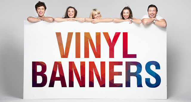
Advertising is an essential part of the activities and processes for any company. It is advertising by which the company can attract customers to its business and increase its sales. In order to advertise, you need a good marketing tool such as outdoor vinyl banners. In fact, these banners can be a highly effective tool for marketing purposes. On the other hand, its effectiveness depends greatly on its design.
After all, banners are visual forms of advertising. A good design makes it easier to catch the attention of the people passing by. Once attracted, the people will notice the marketing message printed on it and take the requisite action. Here are a few tips by which you can ensure the appeal of your banners and get the customers’ attention.
The Size
The first thing you need to take into account is the size of the banner. By their very nature, banners tend to be big and sizeable. Their size is one of the factors that affect their capacity for attracting people. On the other hand, the size depends on the location in which the banner will be displayed. Roadside banners tend to be very large while those placed near shops and in malls are smaller.
The Colors
Once you have determined the size, you can proceed to the actual design phase. Consider the colors that you wish to include in the banner. Generally, it is a good idea to use the brand colors as the base for your banner. This gives a consistency to your marketing efforts and contributes greatly to the branding of your company. At the same time, it helps if the colors are visually striking as such colors can capture the attention of the customers easily. Make sure that the background and the text colors are complimentary to each other. This ensures the readability of the printed information.
The Text
You need to use a marketing message that is strong and capable of capturing the interest of the readers. Banners do have a lot of space. However, you cannot put in a lot of information. After all, outdoor vinyl banners are meant to be viewed at a distance. People should be able to read the message clearly even if they are a bit far from the banner’s location. Therefore, you should keep the message short and the font size large. Of course, you can create a hierarchy of the information by using different font sizes. In such cases, ensure that you are not using more than 3 different font sizes.
The Images
To enhance the visual appeal of the banners, you can implement images in the banner. Of course, the images should be relevant to the message printed on it. At the same time, ensure that the colors of the image do not merge with that of the background. Moreover, you must always use images of a high resolution. Otherwise


0 Comments